Everything You Need To Know To Become A Front-End Programmer
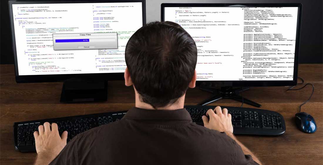
If you’ve ever seen a program or website and wondered what how it was made, then a front-end development job may be in your future. Every link you press or button you click is all set up by programmers. Front-end developers don’t set up how the website looks but rather how it functions. Here are some of our top things to know if you wish to be a front-end developer.
Languages: HTML & CSS
These two languages are the basic bread and butter to design and development. They are considered to be the basic building blocks when it comes to website programming. HTML let’s you add content to the page while CSS is a way to format everything. You really can’t get far in web development if you don’t at first learn the basics.
Advanced Language: Javascript
After getting down the basics, your next step would be to learn Javascript. This language allows you to add a little bit more functionality to your website. Javascript, as a level of basic understanding, allows you to add different, usually interactive elements to your website. Creating maps, games, and anything that needs to update in real time is made significantly easier with Javascript. The fact that you can interact with a page without the need for it to reload is often thanks to this language. Javascript is one of the most popular programming languages in the world. We highly recommend it for anyone whose thinking about dipping their toes into the realm of web development.
Advanced Language: jQuery
jQuery is a specific library created with Javascript. It’s a massive collection of plug-ins and extensions that makes your life a whole lot easier. It’s mostly used for the purpose of not having to code every element on your new website from scratch. This library is great for items that need automatic countdowns, image galleries, specific page effects, and so much more!
Learning How To Create Responsive Design
While the aspects of design itself are left to those in that field, responsive design is a little bit different. Responsive design means that with the way the website’s content is laid out, it has the ability to change and adjust dependent on whatever screen its on. For example, if the page is viewed on a mobile device it would still be efficient to use compared to its desktop counterpart. With most of the world’s internet traffic being from mobile devices this is especially important.